Intuitiveness – Refreshed UI
Tips and Tricks • Campbell Yule • 1 June 2016
AEC - Tip of the Day, Archicad, Ci Tools
ARCHICAD 20’s key message is “A Fresh Look at BIM”
The first impression of this “fresh look” is an updated User Interface (UI)
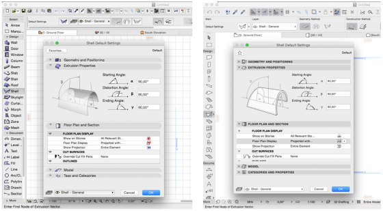
ARCHICAD’s new interface provides a larger, cleaner workspace free of visual noise. Rarely used functions have been restructured and superfluous graphical elements eliminated. The result: a unified, dynamic, up‐to‐date and professional look for the user interface, which is in harmony with Windows 8/10 and OS X.
Key features of the new UI include:
- The new, horizontal Quick Options bar (at the bottom of the workspace) is easier to access than the palette, for faster changing of View Settings as you work.
- The Pop‐Up Navigator (accessible from the tab bar) now includes many more Navigator items and controls, including nearly every context menu command you might need. Thus, you don’t always need the Navigator Palette open, which is turned off by default in the INT template, freeing up more space on screen. The Pop‐Up Navigator is no longer a fixed height: it resizes automatically, to show more information, based on the amount of content and screen size.
- The Info Box has a new header item to help you identify controls faster. (Switch it off if you don’t need it.)
- Font sizes and font types have been revamped for a more uniform, cleaner look.
Along with the update UI all the ARCHICAD Icons have been re-created. Icons on the ARCHICAD 20 user interface are now vector‐based, so that all user interface elements display perfectly regardless of scale. As part of overall interface renewal, most icons have been redesigned for a lighter, more professional look.
![]()
You can see more in the following movie: